Category: Design

Digital design principles shape how users experience, understand and interact with digital products. This category highlights practical, creative approaches to websites, branding and digital interfaces.

Topics cover UI/UX principles, visual hierarchy, typography, layout strategies, branding elements and creative assets for web and social platforms. You will also find concise tutorials and case studies that show why specific design choices work and how they drive engagement and conversions.

Whether you refine layouts, improve usability or craft clear visuals, the Design category connects creativity with purpose. Content targets designers, developers and business owners who value considered design that performs, enhancing clarity, trust and user experience across digital platforms.

  • Look That Lasts: Building a Brand Identity That Outlives Design Trends

    Look That Lasts: Building a Brand Identity That Outlives Design Trends

    Trends fade. Identity endures. Look That Lasts is the second pillar of Digital Intent, and strong brand identity design asks a deceptively simple question: will your branding still work in five years?

    Many businesses chase whatever design trend currently dominates Instagram. However, constant reinvention confuses customers rather than attracting them. Consistency, not novelty, builds recognition.

    Why Timeless Branding Beats Trendy Branding

    Every design trend eventually looks dated. Neumorphism, glassmorphism, and oversized typography each had their moment, then faded. Meanwhile, brands built on genuine purpose remain recognisable decade after decade.

    Consequently, chasing trends wastes budget on redesigns that deliver diminishing returns. Instead, invest once in an identity rooted in what your business authentically represents.

    Four Principles of Brand Identity Design That Lasts

    1. Purpose Before Palette

    Choose colours and typography because they communicate your values, not because they’re currently fashionable. Ask what feeling your brand should evoke, then design towards that feeling deliberately.

    2. Consistency Across Every Touchpoint

    Your logo, website, packaging, and social media must feel unmistakably connected. Furthermore, inconsistency (different fonts here, mismatched colours there) quietly erodes customer trust over time.

    3. Simplicity Over Complexity

    The world’s most enduring logos are remarkably simple. Additionally, simple marks scale better across formats, from business cards to billboards, without losing clarity.

    4. Restraint in Reinvention

    Refresh your identity occasionally, but avoid wholesale reinvention. Subtle evolution preserves recognition. In contrast, dramatic rebrands often confuse loyal customers who already trust your existing look.

    A Practical Branding Exercise

    Write down three words describing how customers should feel when encountering your brand. Then, audit your current visual identity against those words honestly.

    Does your typography feel trustworthy, if that’s your goal? Does your colour palette feel energetic, if that’s your intention? Misalignment here explains why many rebrands ultimately fail.

    Building Your Look That Lasts

    Start by documenting your brand identity design guidelines properly: colours, fonts, tone, and imagery style, even if you’re a small business. Subsequently, apply these consistently across every platform without exception.

    This pillar works alongside Space That Invites to transform passive presence into genuine digital intent. Together, they form the visual foundation everything else builds upon.

  • Space That Invites: A Practical UX Audit for Indian Business Websites

    Space That Invites: A Practical UX Audit for Indian Business Websites

    Can a first-time visitor understand your website within ten seconds? If not, your business needs a website UX audit today. Space That Invites is the first pillar of Digital Intent, and it begins with an honest self-assessment.

    Most Indian business websites still prioritise decoration over function. Consequently, visitors struggle to find what they actually need. However, a focused website UX audit changes this quickly.

    Why Space That Invites Matters First

    Your website functions as your digital headquarters. Therefore, it must welcome visitors rather than confuse them. A cluttered homepage signals disorganisation. In contrast, a clean, purposeful layout builds instant trust.

    Furthermore, Google now rewards strong user experience through Core Web Vitals. Consequently, poor UX doesn’t just lose customers. It damages your search rankings too.

    The Five-Point Website UX Audit for Indian Businesses

    1. Loading Speed

    Test your homepage using Google PageSpeed Insights. Aim for under three seconds on mobile networks. Additionally, compress images and remove plugins that slow page loads unnecessarily.

    2. Mobile Responsiveness

    Most Indian internet users browse primarily via mobile devices. Therefore, your site must adapt seamlessly across screen sizes. Check every page manually on an actual smartphone, not merely a browser preview.

    3. Navigation Clarity

    Visitors should reach any page within three clicks. Moreover, menu labels must use plain language, never internal jargon. Ask a colleague unfamiliar with your business to navigate it blind.

    4. Visual Hierarchy

    Important elements, such as your value proposition, contact details, and calls-to-action, deserve visual priority. Whitespace helps content breathe. Meanwhile, competing banners and pop-ups actively harm comprehension.

    5. Trust Signals

    Display your address, phone number, and registration details clearly. Additionally, genuine customer testimonials outperform generic stock photography. Trust, ultimately, converts browsers into buyers.

    Common UX Mistakes Indian Businesses Make

    Many websites confuse activity with progress. Auto-playing videos, five simultaneous pop-ups, and animated backgrounds do not aid conversion. Instead, they create friction precisely when clarity matters most.

    Similarly, businesses often organise navigation around internal departments rather than customer needs. However, visitors don’t care about your org chart. They care about solving their problem.

    Your Next Step Towards Space That Invites

    Start with a single page: your homepage. Remove every element that fails to serve a visitor’s immediate need. Subsequently, measure your loading speed and mobile experience honestly.

    This simple website UX audit is the foundation of Digital Intent, the first of six pillars. Get this right, and every other investment in your digital presence strategy will perform noticeably better.

  • Digital Intent vs Digital Presence: Why Businesses Need a Design Revolution

    Digital Intent vs Digital Presence: Why Businesses Need a Design Revolution

    Most businesses today have a website and post on social media—they’re present online. But building digital presence for business without purpose is like shouting into a crowded room. Nobody’s truly listening.

    Digital presence strategy business transforms your online footprint from a static placeholder into a dynamic business asset through strategic clarity and purposeful design.

    Understanding Digital Presence vs Digital Intent

    The difference is not subtle—it’s the gap between background noise and meaningful conversation.

    Digital Presence means you exist online:

    • You have a website that’s live
    • You post occasionally on social platforms
    • You appear in search results
    • You maintain basic online visibility

    Digital Intent means you operate strategically:

    • Every design element serves a clear purpose
    • Content solves problems before asking for sales
    • User experience drives every decision
    • Outcomes are measured against business goals

    Visual Noise Dilemma in Contemporary Web Design – A Barrier to Effective Digital Presence Strategy Business

    The digital marketplace faces a unique challenge: visual complexity has become the default language of business. Websites overflow with competing animations, cluttered interfaces drown users in options, and messaging prioritises visual effects over clear functionality.

    Therefore, tendency towards overload can detract from usability, hinder user focus, and prioritise superficial appeal at the expense of intuitive, efficient experiences. Let’s look at the few examples below:

    Example 1: The Restaurant Website – Applying Digital Intent to Building Digital Presence for Business

    Digital Presence Approach: Homepage features rotating banner images, background music, animated menu cards, five pop-ups (newsletter, offers, locations, app download, feedback), and buried contact information.

    Digital Intent Approach: Clean homepage with your location, today’s opening hours, one-click menu access, and prominent reservation button. So, every element answers the question: “What does a hungry person need right now?”

    Example 2: The Professional Services Firm – Strengthening Digital Presence Strategy Business

    Digital Presence Approach: Generic stock photos, lengthy “About Us” corporate history, industry jargon throughout, and unclear service descriptions spread across multiple pages.

    Digital Intent Approach: Client problem statements as headlines, specific outcomes you deliver, case study summaries with measurable results, and clear next steps for engagement.

    Why Digital Presence Fails: Three Critical Mistakess in Building Digital Presence for Business

    Confusing Activity with Strategy

    Posting content daily without a clear strategic purpose does not strengthen your brand; it depletes your time, energy, and resources. A single, well-considered piece of content that directly addresses a genuine customer challenge or need will deliver far greater value than seven days of generic, unfocused updates.

    Mistaking Decoration for Communication

    Visual complexity should never be mistaken for sophistication. When a manufacturing company’s website employs parallax scrolling, animated infographics, looping video backgrounds, and numerous decorative effects—yet visitors cannot quickly discern what products are offered or what the business actually does—ornamentation has overtaken effective communication.

    Prioritising Impression Over Connection

    Designing primarily to impress peers or win design awards, rather than to serve user needs, results in aesthetically impressive websites that fail to convert. A website is not a showcase for creative portfolios; it is a functional business asset whose primary role is to facilitate understanding, trust, and commercial outcomes.

    The Design Revolution: Form Follows Function in Your Digital Presence Strategy Business

    The principle that revolutionised physical design a century ago offers the solution: every element must serve a clear purpose.

    This means:

    • Clean, uncluttered interfaces that respect user attention
    • Typography and layout that enhance readability
    • Colour choices that communicate meaning, not just aesthetic preference
    • Whitespace that allows content to breathe
    • Navigation that prioritises user goals over organisational structure

    Digital Intent in Practice: The Six Pillars of Building Digital Presence for Business

    Moving from passive presence to active intent requires foundation-building with a strong digital presence strategy business:

    Online presence strategy: 6 Pillars of Digital Intent

    Read article: Six Pillars of Digital Intent: Building an Online Presence Strategy That Lasts

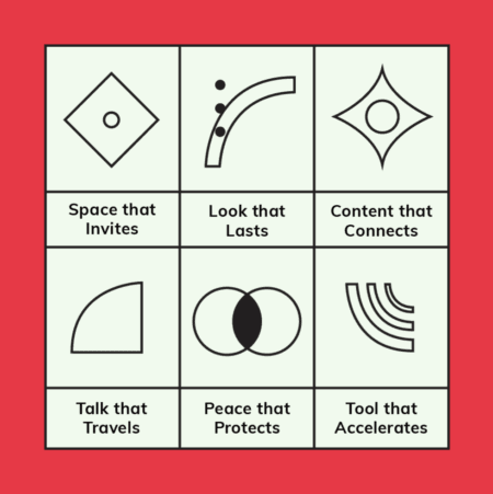
    Space That Invites: Websites designed with user experience as the top priority—fast, intuitive, and mobile-responsive.

    Look That Lasts: Visual identities rooted in enduring principles rather than fleeting trends, creating recognition through consistency.

    Peace That Protects: Robust security measures that safeguard both your business and customer trust.

    Tool That Accelerates: AI automation, in essence that handles repetitive tasks, freeing your team to focus on strategic, creative work.

    Building Your Online Presence Strategy – Mastering Digital Presence Strategy Business

    The businesses that will dominate this year won’t have the most sophisticated designs or largest social followings. They undeniably will be the ones brave enough to simplify while building digital presence for business..

    Start by asking: Can a first-time visitor understand what you do and why it matters within 10 seconds?

    If not, begin stripping away the unnecessary. Remove decorative elements that do n’t serve user needs. Clarify your messaging. Ensure every design choice enhances understanding rather than creates friction.

    Although the digital design revolution India needs isn’t about adopting new trends—it’s rediscovering timeless principles of clarity, purpose, and genuine connection in building digital presence for business..

    The future belongs to brands clear enough to be understood and purposeful enough to be remembered through an effective digital presence strategy business.

    Over the coming months, for this purpose we shall explore each of these six pillars in depth, providing practical frameworks for transforming your digital presence into digital intent. Because in 2026, being simply present online is no longer enough.

  • Six Pillars of Digital Intent: Building an Online Presence Strategy That Lasts

    Six Pillars of Digital Intent: Building an Online Presence Strategy That Lasts

    In today’s digital landscape of endless scrolling and algorithm-driven content, successful brands are not the loudest—they are the clearest. As we move through 2026, businesses must shift from simply being present online to operating with genuine Digital Intent—developing an online presence strategy demands that goes beyond visibility to create meaningful impact.

    India is currently at a unique crossroads and being world’s most populous nation with a rapidly digitising economy, yet we face significant challenges in digital literacy, linguistic diversity and “clutter culture” in app design. Therefore, bringing clarity is not just an “aesthetic choice”—it is a functional necessity.

    A Return to Purposeful Design

    Much like the early 20th-century revolution that stripped away ornamental excess in favour of functional beauty, today’s digital landscape—particularly in India—desperately needs a similar transformation. We are witnessing an overload of decorative elements, cluttered interfaces, and messaging that prioritises flash over function.

    The answer lies in embracing form following function: designing with intention, where every element serves a purpose. This philosophy champions:

    • Clean, uncluttered interfaces that respect the user’s attention
    • Typography and layout that enhance readability rather than distract
    • Colour palettes that communicate meaning, not just aesthetic preference
    • Geometric simplicity that creates visual harmony

    In the Indian digital market especially, where businesses often compete through visual excess, adopting this stripped-back, purposeful approach creates immediate differentiation and sophistication. This online presence strategy requires—one rooted in clarity over complexity—sets forward-thinking businesses apart.

    The Six Pillars of Digital Intent Strategy

    At TheCreatology, we have identified six foundational pillars that transform a basic online presence into a dynamic, high-performing digital asset.

    1. Space That Invites: Web Fundamentals

    Digital Intent presence strategy: Space  that Invites, Web Fundamentals

    Your website serves as your digital headquarters. To convert visitors into customers, it must deliver:

    • Fast-loading and intuitive to navigate
    • Mobile-responsive across all devices
    • Designed with user experience (UX) as the top priority
    • Built on principles of clarity and functional beauty
    • A space where visitors feel immediately at ease

    Key takeaway: User experience (UX) isn’t optional—it’s the foundation of digital success.

    2. Look That Lasts: Branding & Identity

    Digital Intent strategy: Look tha Lasts, Branding & Identity

    Whilst trends come and go, authentic brand identity remains constant. Focus on:

    • Creating a cohesive visual language rooted in purpose, not decoration
    • Choosing design elements that remain relevant beyond current fashions
    • Embracing minimalism: using fewer elements with greater impact
    • Building recognition through consistency rather than constant reinvention

    Key takeaway: Invest in identity, not just imagery.

    3. Content That Connects

    Digital Intent strategy: Content that Connects

    Effective content goes beyond search engine optimisation. Your messaging should:

    • Address real human needs and pain points
    • Provide value before asking for anything in return
    • Communicate with clarity and directness
    • Solve problems through education and insight
    • Build trust through authenticity and relevance

    4. Talk That Travels: Social Media Engagement

    Online presence strategy: Talk that Travels, Social Media Engagement

    Social media engagement is your growth engine. Rather than simply broadcasting, aim to:

    • Spark meaningful conversations with your audience
    • Respond thoughtfully to comments and questions
    • Share content that invites interaction and discussion
    • Build relationships, not just follower counts

    5. Peace That Protects: Digital Safety & Security

    Online presence strategy: Peace that Protects, Digital Safety & Security

    In an increasingly volatile digital environment, protecting your business and customers is paramount:

    • Implement robust data protection measures
    • Regularly update security protocols
    • Treat user privacy as a fundamental responsibility
    • Demonstrate your commitment to safeguarding trust

    Key takeaway: Protection builds lasting credibility.

    6. Tools That Accelerate: Artificial Intelligence

    Online presence strategy: Tool that Accelerates, Artificial Intelligence

    Artificial Intelligence is not about replacing human connection—it’s about enhancing it:

    • Automate repetitive tasks like content scheduling and data analysis
    • Free up time for strategic thinking and creative work
    • Maintain consistent output without risking burnout
    • Focus your energy on what truly matters: Genuine Engagement

    Key takeaway: Automate the mundane to amplify the meaningful.

    The Indian Digital Revolution: Less Is More

    Indian businesses face a unique challenge: standing out in a marketplace where visual complexity has become the norm. The revolutionary online presence strategy 2026 calls for involves:

    • Stripping away the unnecessary: Remove decorative elements that don’t serve user needs
    • Prioritising clarity: Ensure every design choice enhances understanding
    • Unifying form and function: Create beauty through purposeful design
    • Embracing whitespace: Allow content room to breathe and communicate effectively

    This shift from ornamental to functional design does not mean sterile or boring—it means intentional, powerful, and memorable.

    Staying Active on Social Media Improve Online Presence

    Maintaining an active social presence need not be overwhelming. The key is delivering consistent value through:

    • AI-powered content planning: Use intelligent tools to schedule and optimise posts
    • Quality over quantity: Share less frequently but with greater purpose
    • Automated workflows: Streamline routine tasks whilst preserving your authentic voice
    • Strategic engagement: Allocate saved time to meaningful interactions with your community
    • Clear, purposeful messaging: Cut through the noise with direct communication

    Your 2026 Action Plan

    The path forward is refreshingly straightforward: Be Simple. Be Good.

    • Eliminate unnecessary complexity from your digital presence
    • Design with purpose: every element should serve a function
    • Protect your digital assets and customer data rigorously
    • Leverage AI to amplify your authentic voice
    • Focus on clarity, consistency, and genuine connection
    Online presence strategy: 6 Pillars of Digital Intent

    By building your online presence on these six foundational pillars—guided by principles of functional design and purposeful communication—you transform your digital footprint from a static placeholder into a dynamic asset that works continuously for your business.

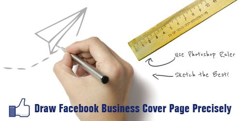
  • Design a Creative Facebook Business Cover page with Exact Dimensions [Updated]

    Facebook updated it’s Business Page Cover dimensions and they are 828 X 351 pixels.

    Last year December, Facebook Timeline was announced/launched for its users. Facebook Timeline organizes your profile just like a vertical scrapbook. It displays, a reverse chronological order of your statuses, photos, videos and links posted by you or tagged by your friends. I really like this feature overruling the thought, a lot of people not liking it. Duh! A change would do you good! 🙂

    design facebook business cover page
    Draw Facebook Cover Page

    Few days back, Facebook updated Timeline feature on Business Page as well, which actually made me think of this article. Well, creating a Facebook cover is no Big Deal if you upload a sunset, a pet or bunch of gorillas. Such casual and lazy efforts looks good on Personal Pages but talking of a business page, you might have to screw keep pets, nature and folks aside. Yes, to impress facebook page fans, you will have to draw some straight lines. Mmmm… we have an objective here to design Facebook business cover page precisely.

    Lets quickly summarize this article for better understanding. The article has been divided into three parts: Basic Requirement, Set Cover Page Layout and Design Business Cover Page. And here we go…

    Basic Requirement

    Here is a list of items you need, to design Facebook Cover Page:

    • Image Editor (We will be using Photoshop in this tutorial)
    • Business Page Theme (Business Website, Graphic Banner or Company Logo)
    • Cool Fonts (optional)

    Set Facebook Cover Page Layout

    In this step,  we will prepare Cover Page Layout to match exact dimension and it is recommended for Best results. Follow a simple procedure below:

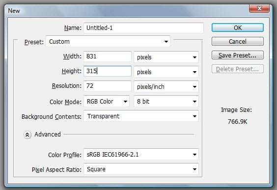
    • Open image editor and Create a New PhotoShop Document with Width: 851 pixels and Height: 315 pixels. For Facebook cover page exact dimensions refer to screenshot below.

    Set Facebook Cover Page Layout
    Set Facebook Cover Page Layout

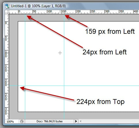
    • Cover page requires three guidelines for accurate layout. Set first guideline at 24 pixels from Left, set the second guideline at 159 pixels from Left and set the third guideline at 224 pixels from Top. (Refer to screenshot below)

    Set Guidelines Cover Page Layout
    Set Guidelines Cover Page Layout

    • Save the Document and we are all set with the Cover Page Layout.

    Design Facebook Business Cover Page

    We are just a step away from your Awesome Business Page Design. Are you ready with your Theme ? If not, then give it a thought or you can also refer our article to Create Twitter Background. Once ready with Business Theme, with no further delay lets go ahead with Facebook Cover Page design.

    1. PLACE THEME ELEMENTS – BE CREATIVE

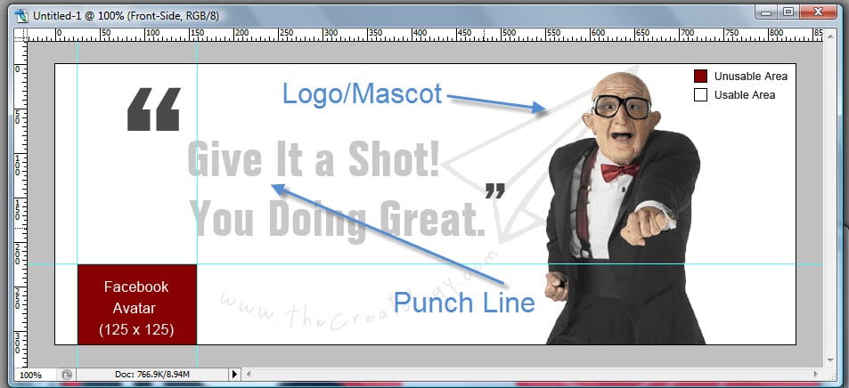
    Depending upon our Business place elements, like banner, slogan, punch line, logo or services in the Cover page. Feel free to express your creativity in this step, don’t forget to refer screenshot for usable and unusable area.

    Place Facebook Cover Elements
    Place Facebook Cover Elements

    2. FACEBOOK AVATAR SIZE

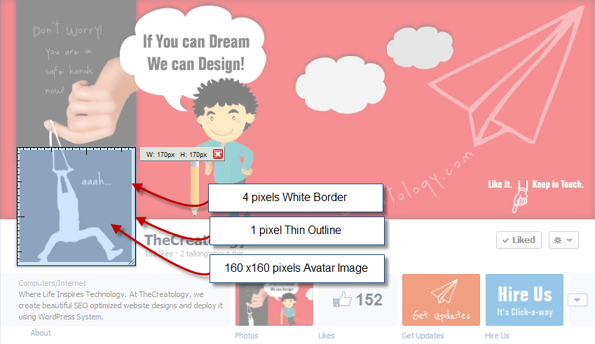
    Facebook avatar, so called Profile Picture is also part of Facebook Cover page. Facebook Avatar Image size is 160 x 160 pixels along with 4 pixels white border and dark 1 pixel outline around, making the Avatar Image Box as 170 x 170 pixels. (Refer to the screenshot)

    Facebook Avatar Image Sizes
    Facebook Avatar Image Sizes

    Already done with above two steps ? Yes: Bravo, No: Keep Working! Designing is a never ending activity and should never stop, until you are done.

    You can see a Demo TheCreatology Facebook Page.

    Wasn’t It fun?

    I am sure it was, but its your time to express now and think with creative mind. What do you think about this article ?

    Share it with friends, if it was helpful! Any doubts, use the comment box below. 😉

    Why this update?

    This post is updated with new Facebook Fan Page Cover Size and Dimensions, as Facebook changed Cover page dimensions.

    Published on: Apr 07, 2012
    Revised on: Aug 03, 2012
    Revised on: Aug 17, 2016

  • Quick-n-Easy way to Create Twitter Background – Part 1 [Design Layout]

    You must be thinking why am I writing this article, when Mashable already has explained about Twitter Backgrounds 2.5 years back. Well, reply to this thought, is this article in which you will learn Quick way to create custom Twitter Background. If you are tired of changing or have spent a lot of bucks in getting a Custom Twitter Background, then this article is for you.

    Twitter-Custom-Background-TheCreatology

    Last December 2011, Twitter changed its User Interface layout for the second time. Well, it happened for good, as Twitter adapted new html5 features. It sure is surprising for Tweeple (people who tweet), whereas annoying for few, who paid so much to get Custom Twitter Background done and it needs rework again.

    Don’t worry, I have a tutorial for you below which will help you to create twitter background easily. The tutorial is divided into three parts: Basic Requirements, Prepare Theme & Design Twitter Background Layout.

    Basic Requirements

    Here is a list of items you need, to create custom Twitter background:

    • Image Editor (eg. Photoshop)
    • Internet Browser with screenshot plugin (optional)
    • Cool Fonts to Impress (optional)

    Prepare Theme

    This is an important part of the tutorial, where we will prepare and collect information to design custom twitter page. To do so, lets go through few points below:

    • Expression: The page should reflect Who You Are? a blogger, a photographer or a biker. What You Like? a Apple iPhone or a Ducati 848. It should reflect your interest and help people to know more about you.
    • Branding: The social branding conforms to have your bio, photo or avatar and contact information.
    • Show Time: After all its your page, so give it a shot. Of-course use your mad skills here. 😉

    Design Twitter Background Layout

    Now that we know what we want in our theme, lets start with the layout design. Check out easy steps below:

    Create Latest Twitter Layout. Best way to find out the latest twitter background layout is itself twitter, check how…

    • Set your monitor resolution for the most optimized version, For Instance, in this tutorial we will be using 1366px X 768px screen resolution which also is commonly used resolution.
    • Once done, open your twitter page in any browser and Press “Prnt Scrn” on your keyboard. In case if you have a screenshot plugin installed in your browser then quickly take a rough screenshot of the visible area of your twitter page.
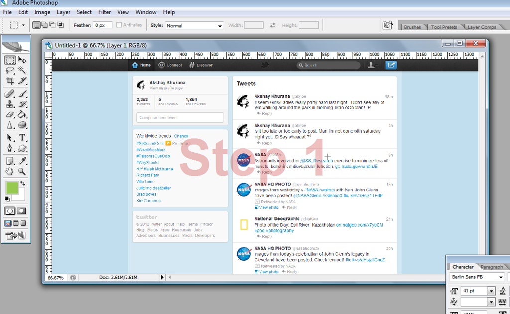
    • Next, open Adobe Photoshop and paste/import the screenshot file, just as in the image below.

    Create-Twitter-New-Layout-Step1
    Step 1 – Latest Twitter Screenshot

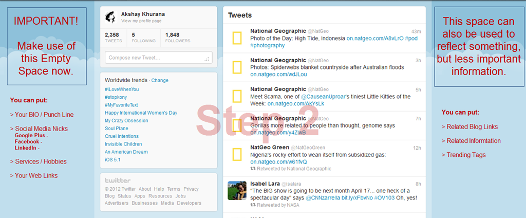
    • Now that you can easily make out in the screenshot above, usable area which is in blue color background as shown in the screenshot below.

    Create Twitter New Layout-Step2
    Step 2 – Prepare Twitter Theme

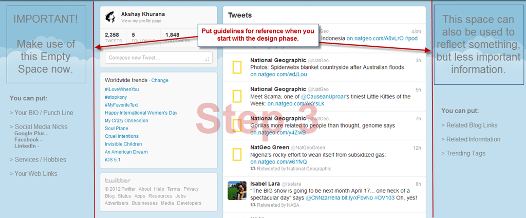
    • Next step is to setup guidelines, which will be a reference, when we will start with the design phase in tutorial [Part 2]. (Refer the screenshot below)

    Create Twitter New Layout-Step3
    Step 3 – Setup Guidelines for Design Phase

    • Save the PSD file, once you are done with setup of guidelines for new twitter background.
    • Take a break, for the work accomplished, Yes I am Serious we are done!

    Now wasn’t that easy of a tutorial, just with hit of “PrntScrn” key and here we got latest twitter layout ready. Well now that we are all set with new twitter background layout and we shall proceed for the design phase. Leave your comments, incase you have any feedback, queries or doubt in your head.

    PS. > Design Phase Article Link will be available shortly here. (Keep in touch via twitter or subscribe to our blog)

  • Design glass button image sprite for website in Photoshop

    Are you looking for glossy button design for website, similar to the image below ? Then you can design glass button by yourself in simple steps using photoshop.

    glass button image sprite for website
    Glass button image sprite for website

    In this article, I will use Adobe Photoshop to create glass button sprite. Image sprites are purposely used by CSS developer to design mouse over image, function smoothly and efficiently. Here is the tutorial to design glass button image sprite for website in photoshop.

    Step 1: Create Simple Button Base

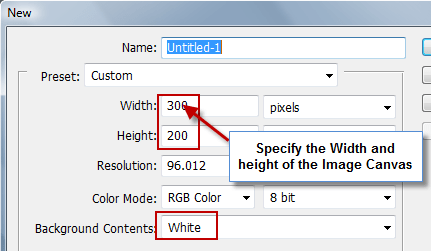
    To start from scratch, Open Photoshop and create new image canvas with approximate pixels for width  and height. If you want create transparent website button then choose Transparent in Background Contents, or you can stick with White background as well. (Refer to the screenshot below)

    Step1-1 design glass button image sprite for website
    Step1-1 Create New Image Canvas

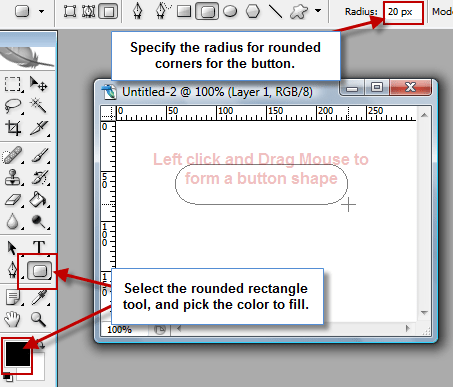
    Create a new layer and name it as button. On the button layer, select Rounded rectangle Tool and give it a desired radius, for instance I give it 20px in this example. Now left click and draw out a rectangle on the canvas. (Refer to the screenshot below)

    Step1-2 design glass button image sprite for website
    Step1-2: Draw Rounded Rectangle base

    Now that we have created base for the button, so we now proceed to our next step 2 to add glossy effect.

    Step 2: Apply Glass Effect to Button

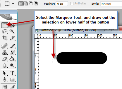
    In order to add glass effect, create another layer and name it as a glass. Select the marquee tool and draw a selection over the lower half of the button. (Refer to the screenshot below)

    Step2-1 design glass button image sprite for website
    Step2-1 Select Marquee Tool

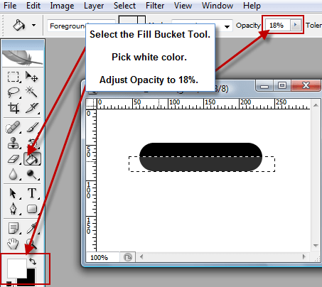
    Now select the Fill Bucket Tool and with white color #ffffff and opacity level adjusted to 18%, fill the selected area. And it should look something like this.

    Step2-2 design glass button image sprite for website
    Step2-2: Fill lower half of the rectangle

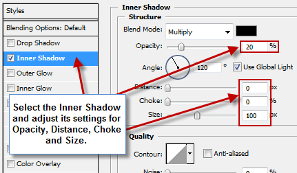
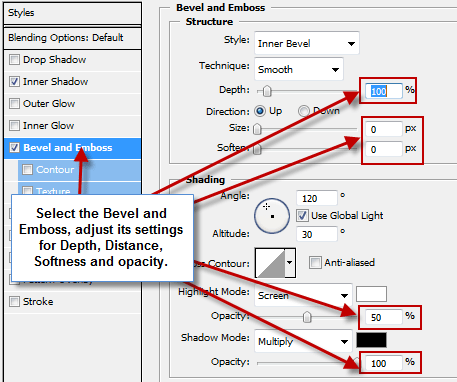
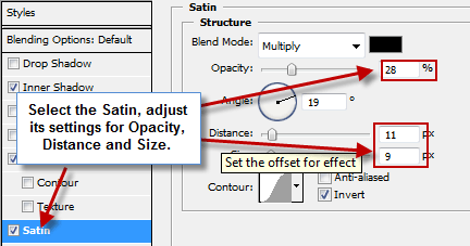
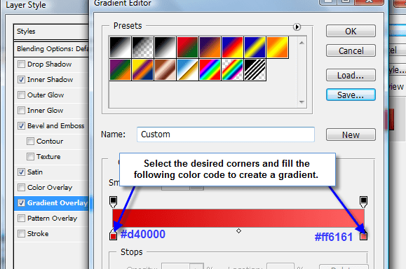
    Now right click on the button layer, open Blending Options and adjust the settings for the following:

    Inner Shadow

    Step2-3 design glass button image sprite for website
    Step2-3 Inner Shadow Adjustment

    Bevel and Emboss

    Step2-4 design glass button image sprite for website
    Step2-4 Bevel and Emboss Adjustment

    Satin

    Step2-5 design glass button image sprite for website
    Step2-5 Satin Adjustment

    Gradient Overlay

    Step2-6 design glass button image sprite for website
    Step2-6 Gradient Overlay Adjustment

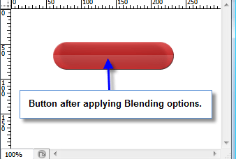
    After adjusting the blending options, the button should look like this.

    Step2-7 design glass button image sprite for website
    Step2-7 Button with Glossy effect

    Step 3: Button Text and Finalize

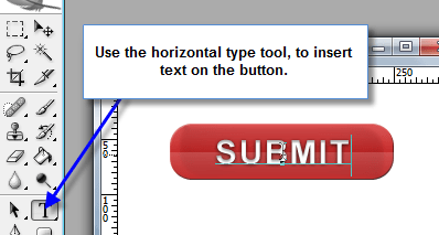
    As in Step 2, we have created the glass button, now we have to add Text and finalize it. To insert text to the button, use the Horizontal Type Tool and add text to the button.

    Step3 design glass button image sprite for website
    Step3 Adding text to the Button

    After adding the text, and nudging a bit we will get the final image. In order to create another button, simply repeat step 1 and then adjust different colors in step 2 to create multiple buttons, just like below.

    glass button image sprite for website
    Multiple Glass button Designs

    Here I come to the end of this tutorial, I’m sure that these glass web buttons will add elegance on your website. If you have any query or further assistance is required, post comment as your feedback.